
Had some time this morning to do a bit more playing in photoshop, trying ways to add colour.

Hmmm. Not sure. It does seem that the purely linear nature of a sketch is at odds with the bulk that colour brings. A sketch allows the eye to make it's own mind up where things are, but colour has to have an edge. And is more dictatorial. Back of the hood is way too heavy. And blue ? How did that happen ?
But in playing around I started thinking about Sargent's charcoal sketches, and how he uses a rubber. And how the Photoshop eraser tool seems to have the same sympathy. It's very different to watercolour, almost the opposite
Hmmm. Maybe try not to be too precious ( and oh does the geek fan-boy needs slapping down as I write that ! ) with a fidelity to the original line. Let the two co-exist, like... well, yes... like layers.
Oh look, if I alter the background...

Okay, definitely something to learn here.
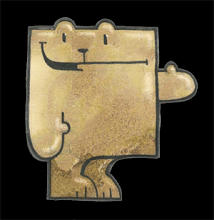


The linear background is not working for me unless this guy is having a strong conversation with some form of deity. I do like the color work of the second better, but still think some stronger contrasts are called for.
ReplyDeleteJust my 2¢ which I'm sure you don't need! Carry on!
Blimey, you are right, he looks like a monk.
ReplyDeleteThoughts taken on board, and thanks for your feedback, all good.
Try using Corel Painter for painterly effects. The tools are way better than PS (IMHO)and highly customisable.
ReplyDelete