Sunday, 30 January 2011
Hood again
A second sketch of the massive hood from a few weeks ago. No colour, but still love that coat.

Saturday, 29 January 2011
Polyanthus moment
Was having a general clear up of the laptop, and found some paintings I had scanned. So, before I chuck them away ( the scans that is - the paintings have long since found walls to hang on ) I thought I'd pop some here. Can't hurt.


I love polyanthus. It's that time of the year again. There is a nursery near me that fills it's greenhouses with thousands of them. It's just full on colour and scent. And dirt cheap. And it takes me ages to choose as I have to inspect every colour combination going. I do grow them at home as well, but nothing means spring is coming like those greenhouses. Then you bring them in and sit them on the windowsills, above the central heating, and the warm air drifts up their scent to snag you every now and then, stop you, just for a second, ambushed by their promise.
Gonna have to go get me some now.
Wednesday, 26 January 2011
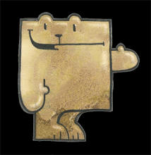
BIG coat
She was swallowed by it, I swear. And half a mile of chunky woolen scarf to keep any heat from escaping. Yet she sat there as cool as you like, half asleep, listening to people's phone calls home.


Added the colour later, pleased with the coat, but her face got all muddied, even more so after scanning.
Tuesday, 25 January 2011
Two instances of a neck
Was on a rush hour train that was so crowded I thought I might have to eat my rucksack to make room. Usually sketching is out of the question, but found an air pocket against one of the dividing glass panels, looking down on some bloke's neck as he read the Evening Standard. So out surfaced the sketch book.


Was taken with the very pale curve of his neck against the darks of his coat. Very strong contrast.

Prefer the top sketch.
As is always the case the whole train emptied at my stop. I sure must live in a popular part of town, Mr Terwilliker.
( For popular read cheap ! )
Monday, 24 January 2011
The colour red.
Watched THREE COLOURS RED last night. Film loves red ( well, some film stock more than others, but we won't go into that now, especially when more and more is shot on digital - and, funnily, the most popular digital camera system - or at least the one I come across most - is called RED ) Red shoes, Red balloons, Red lanterns, Red river ( black and white I know, but bear with me )
And I was thinking about Dufy's theory that colour stays on the retina longer, but it seems to me that some colours, especially red, catch the eye sooner, so maybe they only seem to register longer. How does the eye see color ? Anyone know. Need to go look it up.
This woman's coat was the most brilliant red. Haven't done it justice here.

Hang on, maybe I can...

There, that's what it was like.
Friday, 21 January 2011
cream paper sketch
I know, pushing it a bit, but low on supplies at the moment.


Another sketch where the distortion adds to the overall, in my opinion. Everyone should have the lower half of their face bigger than the top.
Adds gravitas.
Thursday, 20 January 2011
No colour
Unless you agree that black is a colour too.


This guy was so armed against the world. Cap pulled low, scarf up high, dense beard, peering out through the shadow. Impenetrable. Impervious.
Just how you need to greet some days.
Wednesday, 19 January 2011
So... pt 2
Well that didn't go as planned. I am not brave enough to be as loose. The end result is...


...weak and muddy.
I had a warmer colour for the outline, but it disappeared, so went for a stronger dark purple, but, whilst it kinda works for him, it is way too heavy for her. She looks almost armoured !
Although who is to say this is the end result !
So...
Having looked at Mr. Dufy ( last post ) am putting some thoughts into practice.
Here is original sketch, two people on the tube.


Here is original sketch, two people on the tube.

And have worked over the top in loose, but hopefully thought through colour.

Now am going to redraw again, in paint. Back soon.
Friday, 14 January 2011
Analysis
Took some time to stop by the Tate Modern, in hope they might have a Dufy on display. And they had his portrait of the Kessler family on show. Go see it. You owe yourself.
http://www.tate.org.uk/modern/explore/work.do?id=17286&action=4
Anyway, spent some time looking at it and realised that, although they appear effortless, there are many layers of working going on in them. I had mistakenly assumed that after sketching and all the prep work, that he would lay down the colour, and then do the line work over the top. But I can now see that he builds these apparently impulsive gestures very slowly and methodically.
Take this area of Mr. Kessler and his horse.

Although it at first looks like line over blocks of colour, if you study it you can see the order in which he worked.
After first ( I assume ) sketching the image on the canvas, he laid down the base colour for the Horse (A), then working in a warmer body colour (C), and the outline in brown (B).
On top of this he drags a brush loaded with half mixed brown and white for the Stirrup leather (D), before outlining this in the brown as well (E). Then, clearly over the top of these he draws a stroke of white for the metal of the stirrup (F) before a brush of blue to colour and outline it (G). Then another layer of the brown for the boot toe (H), before finally outlining this in brown as well (I).

Seeing how these layers overlap means he took time with these apparently loose paint gestures, allowing the oil to dry between times. And even though, in themselves, each mark appears impulsive, he had planned exactly how he was going to depict each piece.
So believing I can do a sketch and then just whack some colour on it will only end in unsatisfaction. Need to look closer, and more.
Saturday, 8 January 2011
Bugger it.
Today's post is terrible, so bad that I am going to break my rule and self censor. It became more about the process than the person. And was BAD. So no show, sorry.
Instead I am going to direct you over to http://samchurch.blogspot.com/. He did a post in direct response to a comment I made, and I have been meaning to link to it for ages. Go see. Great work.
Instead I am going to direct you over to http://samchurch.blogspot.com/. He did a post in direct response to a comment I made, and I have been meaning to link to it for ages. Go see. Great work.
Wednesday, 5 January 2011
Does this work ?
Hmm. Gonna have to take this out into the field a bit more, but this is where I am thinking at the moment. Following through on the Dufy thing.


Maybe... Hmmm... Thinking...
Tuesday, 4 January 2011
Blue coat
To calm down after the backpack, like adding cream to spicy food, just to curb the bite out of it.


For some reason liked the paler stripe across this guy's coat.
Whatever catches your eye.
Fluorescent backpack
So, there was I, wondering where I was going to find any colour in the scrubbed clean grey of early January... and this bloke stands bang in front on me ( nearly takes my nose off actually ) with...

THE BRIGHTEST BACKPACK IN CHRISTENDOM.™

Nothing can quite convey the orangey shock of it. He isn't going to get lost in the snow, that's for sure.
The only fluorescent paint I had in the house was a spray can on it's last splutter, but what the hell, I like the mess it made. It seems my scanner can't really handle flourescent colours, but I like the eyeacheyness it sort of gives it. ( and yes I know, that isn't technically a word )
Sunday, 2 January 2011
Eraser + Dufy
Managed to fit a trip to a Dufy Exhibition in the scrum of last november ( thanks Sophie ! ) And at the start it said Dufy believed colour stayed on the retina longer than form. And that has caught in my head, and is probably the basis for what I want to explore here. Early days, let's see where it goes eh ?
Got a bit excited by using erasure at very low opacity in Photoshop just now...

Got a bit excited by using erasure at very low opacity in Photoshop just now...

I know, more a shaded sketch than anything Dufy was about... but Rome.. you know...
Plus... great coat Mister !!!
Saturday, 1 January 2011
All the best for 2011
Make it the best year you have ever had. All of you. I know this. 2011 is going to be phenomenal. Astronomical. Astounding. I can't wait...


Not least because I will get back to giving this the proper attention it deserves.
Subscribe to:
Comments (Atom)